


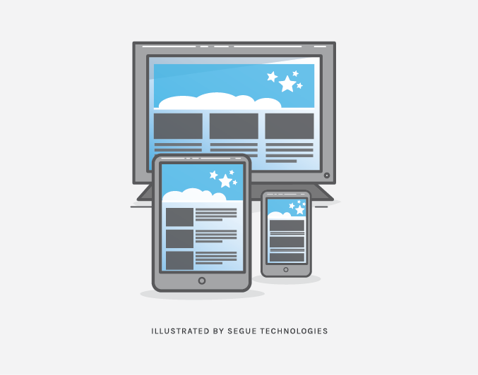
WordPress is one of today’s more popular Content Management Systems (CMS) and, like any other website, it must incorporate responsive behavior in order to be relevant in today’s web viewing environment. The graphical interface for all WordPress sites is controlled by themes – a collection of template files that not only create the graphical interface of the site, but also allows developers to control the presentation without modifying the underlying php software. Developers can utilize default WordPress themes, incorporate third party themes, or create their own custom themes. Responsive themes are available through many of these third parties, but in most instances, developers must design and implement their own. That is what Segue Technologies implemented for one of our customers: The Hybrid Shop.
Creating a Custom WordPress Theme
When creating your own theme, how do you create a responsive custom theme? A WordPress theme consists of several entities (Navigation menu, Headers, Footers, Sidebar, and Widgets) and each present their own challenges. The first step is to create wireframes for each page as rendered for each environment (smartphone, tablet, desktop). Take particular care for the Navigation menu and Sidebar, especially if your site utilizes sub-menus.
For The Hybrid Shop, each sub-page consists of a main navigation menu and a sub-menu. Both of these menus had to be redesigned from a desktop layout and we chose differing accordion styles. For sidebars, we chose to move the sidebar layout to a single column for smaller screens. For Widgets, we created multiple CSS styles changing the layouts and font sizes to match the environment. Make sure you review our post using CSS3 and media queries as explained in How CSS3 Supports Developing Responsive Design Websites.
For The Hybrid Shop site, we designed two versions of the Navigation menus, one for the desktop and the other for tablets and smart phones. We used media queries to determine when to change the tabular menus to accordions and then utilized jQuery to open or close the menus. In our html, we created two div elements to act as containers for each style of menu. Then we dynamically display each element based on the environment. When the screen width is below 61.25em we hide the horizontal navigation menu and display the vertical – or drop down menu.
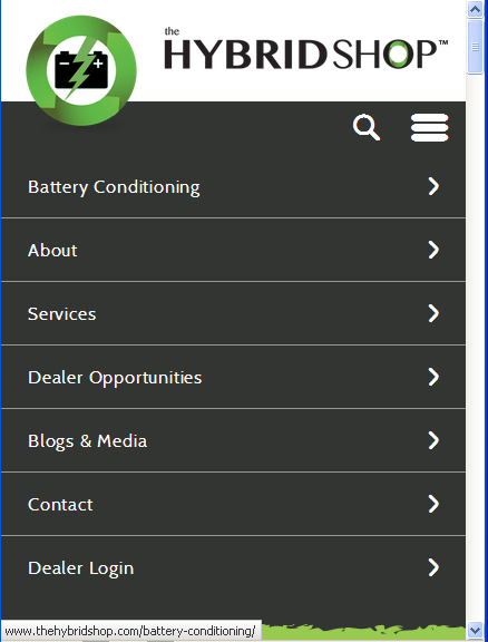
Figure 1. Main Menu
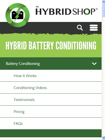
Figure 2. Sub-Menu
@media screen and (max-width: 61.25em) {
navigation--main {
display: none;
}
.navigation--main__drop-down {
display: block;
}
}
For sidebars, we followed the same process and used media queries to move the sidebar content below the main content. This is accomplished by changing the width property of the sidebar class to 100%. On a desktop the width for the sidebar is set to 30%, but on tablets and smart phones the width is changed to 100%, forcing the sidebar to be displayed the full width of the device. See Figure 3.1 and 3.2 (Primary Sidebar Layout) and Figure 4. (Responsive Sidebar Layout).
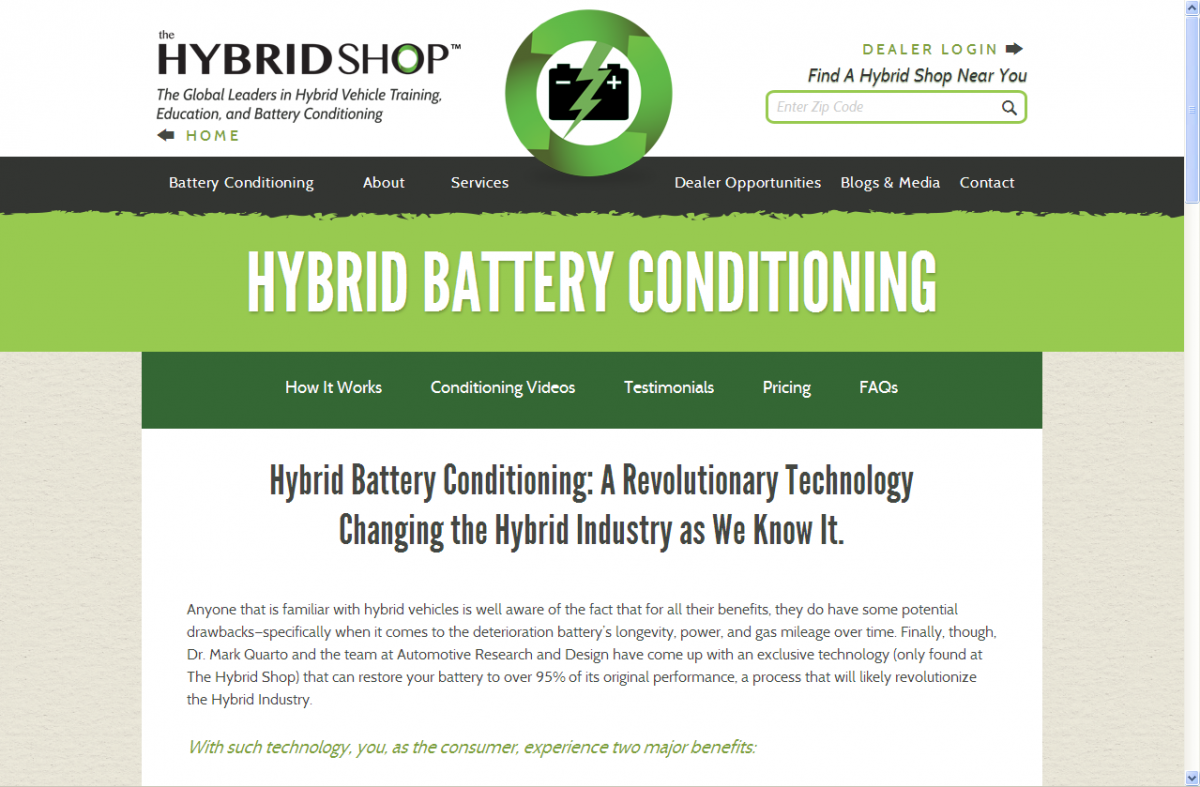
Figure 3.1 Primary Sidebar Layout

Figure 3.2 Primary Sidebar Layout

Figure 4. Responsive Sidebar Layout
.page__main__sidebar {
width: 30%;
}
@media screen and (max-width: 61.25em) {
.page__main__sidebar {
width: 100%;
}
}
Finally, you will have to examine other widgets and layouts to make sure all are responsive. In our “The Hybrid Shop” example we were forced to handle the footer layout with care. We changed our three column grid layout to a singular column layout and changed the size and markup of individual elements. See Figure 5. Desktop Footer and Figure 6. Responsive Footer.

Figure 5. Desktop Footer
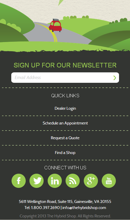
Figure 6. Responsive Footer
In conclusion, designing responsive WordPress sites is possible, but requires detailed planning and wireframes for all WordPress features – particularly menus, sidebars, and widgets.