


“Try going through all of the Web designs that you love, strip out the images and ask yourself, ‘how would that website look with just text and spacing?’ When designers say, ‘text is the interface’, they really do mean it.” {source}
The term “typeface” is often confused with “font,” which is a specific size and style of a typeface. Fonts and typefaces are technically different though relate to the same thing. Think of a typeface as the “design” of the design of the alphabet; the shape of the letters that make up the typestyle. For example, Helvetica is a typeface, while Helvetica 10 pt bold is a font. It’s a small difference, but it is good to know. Typefaces can be made up of numerous font files. For example, Helvetica.ttf is a font. No matter how many files there are, it’s still one typeface.
“What font is used in the new Star Wars movie”? “Do you recognize the font in the attached PDF”? How much does this distinction matter in day-today conversation? It depends on whom you ask. Most people use the two terms interchangeably, although the correct name is “typeface.” Graphic designers choose “typefaces” for their projects but use fonts to create the finished art.
Why Are Typefaces Important?
Typefaces are just as important to the visual effect of the webpage as images. Typefaces carry the personality of your brand and choosing the right one for your website can reflect the voice and tone necessary to tell your story. Picking the right typeface can grab readers’ attention, or turn them away before they get through a complete sentence.
As a designer, I believe that the typeface you select for your brand is an important attribute of how your business and product is perceived by others. Nowadays, though, you can access numerous professional typefaces to use on your websites, bringing the aesthetics of print design to the web.
Considerations When Selecting a Typeface
Here are a number of things to consider when selecting the right typeface for your website:
1. Know Your Content First. Content Precedes Design.
First and foremost, you’ll need to know what kind of content you are dealing with before you can even begin to think about what typeface you’ll use. Figure out what kind of content is most prevalent in your project and choose the typeface that satisfies the needs of that content.
“Design without content is decoration. It used to be that you worked on look and feel before you thought about content. But it’s actually very hard to do design without content.” {source}
2. Know Your Audience
Does your audience consist of an older population? Is your organization’s site formal and serious? Or playful and lighthearted? How do you want people to feel when reading your content? There are a lot of beautiful typefaces out there, but not all of them will be perfect for your project. Knowing your audience and/or developing personas is critical to any marketing effort, and it remains important when choosing the right typeface for your website.
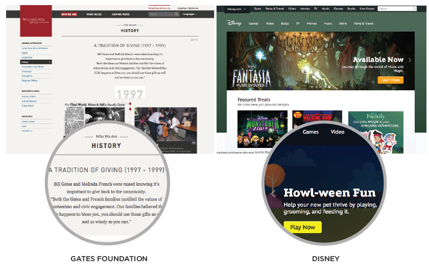
For example, the target audience of The Gates Foundation is different than the target audience of Disney. Some typefaces are more serious, and some are more casual and playful. Knowing who your audience is (or will be) can greatly narrow down the field of type to choose from.
3. How Many Typefaces Should I Use?
You can absolutely design an entire website with just one typeface, but it’s always fun to mix it up to create hierarchy and visual interest. However, I’m not saying use a different typeface everywhere on your site. I highly recommend that you use no more than three typefaces throughout your website: one typeface for your headings, one for your body copy, and maybe another for navigation.
From a design perspective, using more than three typefaces will make your website begin to look cluttered. It is always smart to choose typefaces with several weights (bold, light, italic, etc) so you can switch up the look of your text and still have a visually cohesive design.
In addition, from a practical perspective, the more fonts you load onto your site, the slower your load speed will be. According to Kissmetrics, almost half of users abandon a site if it does not load within three seconds.
4. Legibility and Readability
Is the type on your site legible? Is the typeface set to an industry standard size? Should I use a Serif typeface vs. a Sans Serif? It is always important to remember that your choice of typeface needs to strike a good combination of both legibility and readability.
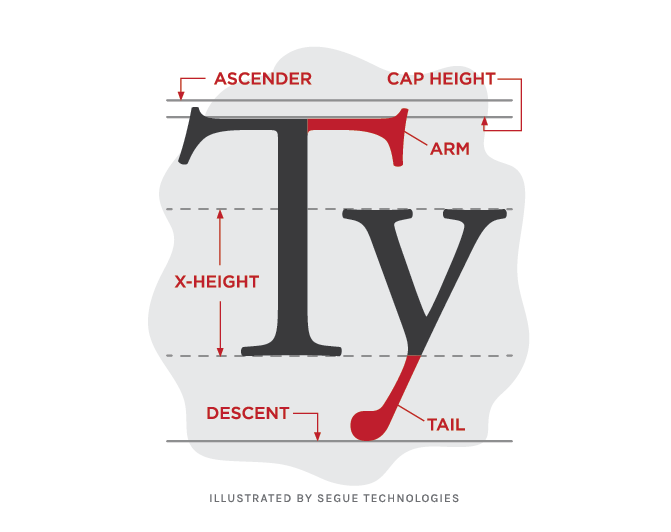
“Legibility is a function of typeface design. It’s an informal measure of how easy it is to distinguish one letter from another in a particular typeface. Readability, on the other hand, is dependent upon how the typeface is used. Readability is about typography. It is a gauge of how easily words, phrases and blocks of copy can be read.” {source}
At the end of the day, you don’t want your users to spend hours reading text that is too hard to read, too cluttered, or too small. Character shapes, size of type, letter spacing, weight, line height are some of the key elements in the design of a typeface which can contribute to its legibility. Your main goal is to choose a readable typeface that will capture a visitor’s attention and encourage them to stay on your site longer.
5. Maintain Your Brand Consistency Both Online and Offline
Many of the classic typefaces used in print have licensing restrictions and compatibility issues that prevent their use on the web. Although there are more resources for integrating typefaces on the web now, sometimes it’s a little tricky to find a web typeface that is similar to your printed branding.
In this case, it is important to find web-ready fonts with typefaces comparable to what your brand has historically used. Find fonts with similar weights and builds. If your brand uses either a serif or a san serif typeface, the last thing you want to do is to publish something completely different. It is always important to communicate the same tone in print and online to avoid inconsistency in how your brand is presented.
6. Use Tools To Help Find Your Typeface
As I mentioned earlier, there are tons of resources available to find typefaces for the web. Google Fonts and Font Squirrel have enormous collections of free typefaces. Google Fonts gives you the ability to preview your copy in different typefaces and different sizes. It is also very useful in letting you compare the same copy in different faces to select which one works best for you. Typekit and Webfonts by Hoefler & Co. are other incredible resources with licensing options for various costs and allows you to explore your typeface selection at greater depths.
“Good typography gives spirit to words and is a potent mechanism to inform and delight. It doesn’t matter how well-considered your layout is, how wonderful your website’s interactions, code, colors, imagery, or writing are. If your type is bad, the design fails.” {source}
Choosing a typeface for your website can be tricky because there are so many options to evaluate and consider. While there are no specific rules that can be followed to find the correct typeface, applying these tips and guidelines mentioned here can contribute to the success of a website design. By choosing appropriate typefaces and sizes, knowing your audience, and assigning hierarchy where needed, you can greatly decrease confusion and help keep your visitors happy.
References:
Here are some great contemporary type designers whose work I love and admire:
- H&FJ Jonathan Hoefler & Tobias Frere-Jones (My favorite! You probably know them best from their typefaces Gotham (embraced by the Obama campaign) and Archer (originally commissioned by Martha Stewart but now used everywhere.)
- Type Together
- Mark Simonson
- Sudtipos
Here are some site references on type and the anatomy of type:
- http://jasonsantamaria.com/articles/i-wrote-a-book
- http://www.creativebloq.com/typography/how-choose-fonts-your-website-6135586
- http://webdesign.tutsplus.com/articles/choosing-the-right-font-a-practical-guide-to-typography-on-the-web–webdesign-15
- https://www.drivenwebservices.com/tips/typeface-selection-important-website-design
- http://www.smashingmagazine.com/2010/12/14/what-font-should-i-use-five-principles-for-choosing-and-using-typefaces/
- http://www.typographydeconstructed.com/