
In continuation of my first blog, I will be discussing the rest of my Beginner Bootstrap Website. The Bootstrap grid in Figure 1 is very similar to a table. It uses the div tags with class “container” to set up the grid rows and columns. Since I am also using ColdFusion with Bootstrap, in the code I have set up a which selects data from the art gallery database. I have selected to display the customer, order date, art name, and the total price of the order. There is a lot of flexibility with how to size the rows and columns using Bootstrap.To keep it simple, I have used “col-sm-3” which sets the column to size of small and spans three columns. See Figure 2 for the code to create the Art Orders grid.
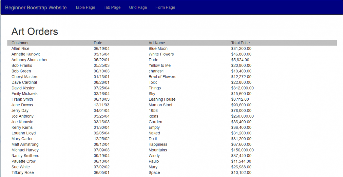
Figure 1
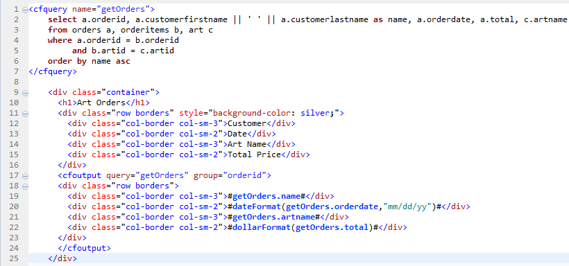
Figure 2
Figure 3 displays a login Form. The login form doesn’t have any functionality for processing. I have created it to demonstrate how to create a form using Bootstrap. The code in Figure 4 shows how the form is created. Bootstrap has a built in form