The foundation of a strong, emotional connection stems from being able to relate to a certain subject. This same principle can be used for making an emotional connection with users on a website. To create a more personal user experience, web designers can use specific design components to elicit certain emotional responses. These components should be refined specifically to the type of brand and the target audience. The components typically associated with emotional web design are imagery, colors, and tone of voice.

Imagery
During an initial first glance, users will quickly decide if a website is visually appealing. Websites with large photo banners can quickly engage a user. In order to ensure that this first encounter is a positive one, brands need to use images that are relatable to their users. People feel more empathetic during face-to-face interactions and this applies to photos as well. Users are drawn to faces and connect more when they are able to recognize themselves within a photo, creating an emotional connection.
Colors
Colors play into emotions psychologically and play an important role in setting the tone for a website. Picking the appropriate colors for a website can help elicit a desired response from users. For instance, colors like red and yellow can make users feel anxious or in a hurry and they would not be suitable colors for a site whose target is to draw users to read content. Blues and greens seem to be a safe bet when appealing to users globally, but even shades of these colors has specific notions tied to them. For example, light and dark blue are considered calming, but dark blue is also a good color to showcase strength and security. Keeping in mind the specific emotional connections users have with colors will help you design a site that better connects more with your target users.
Tone of Voice
Words deliver a message, but tone of voice dictates how that message is received. The simple wording of a header title can form the personality of a website. What tone of voice should a brand’s website communicate to users– professional, empathetic, comedic? The answer should be directly related to what the users are coming to the site for.
Emotional Web Design in Action
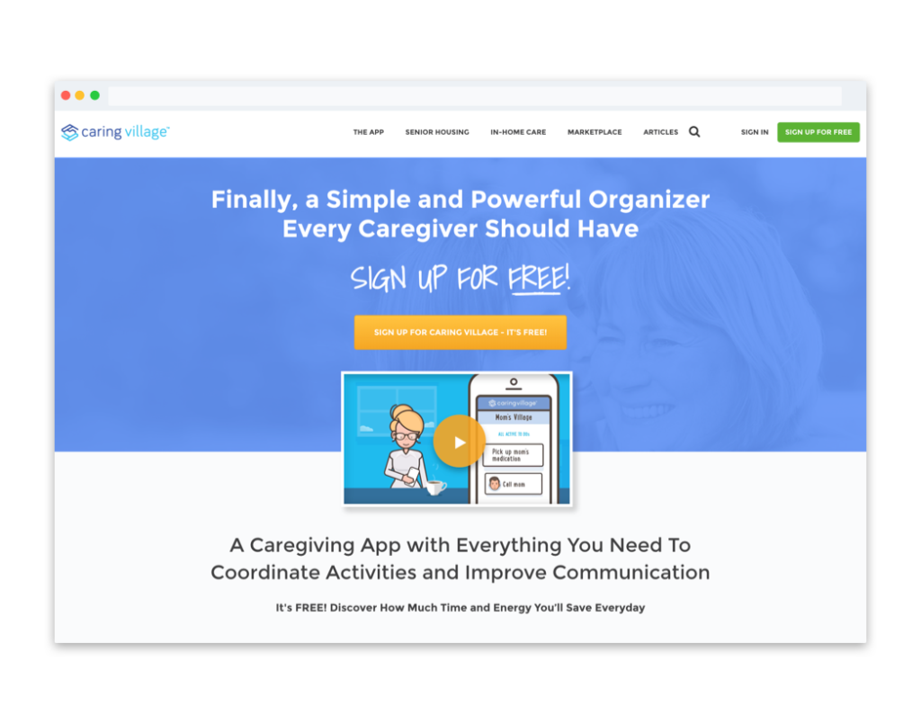
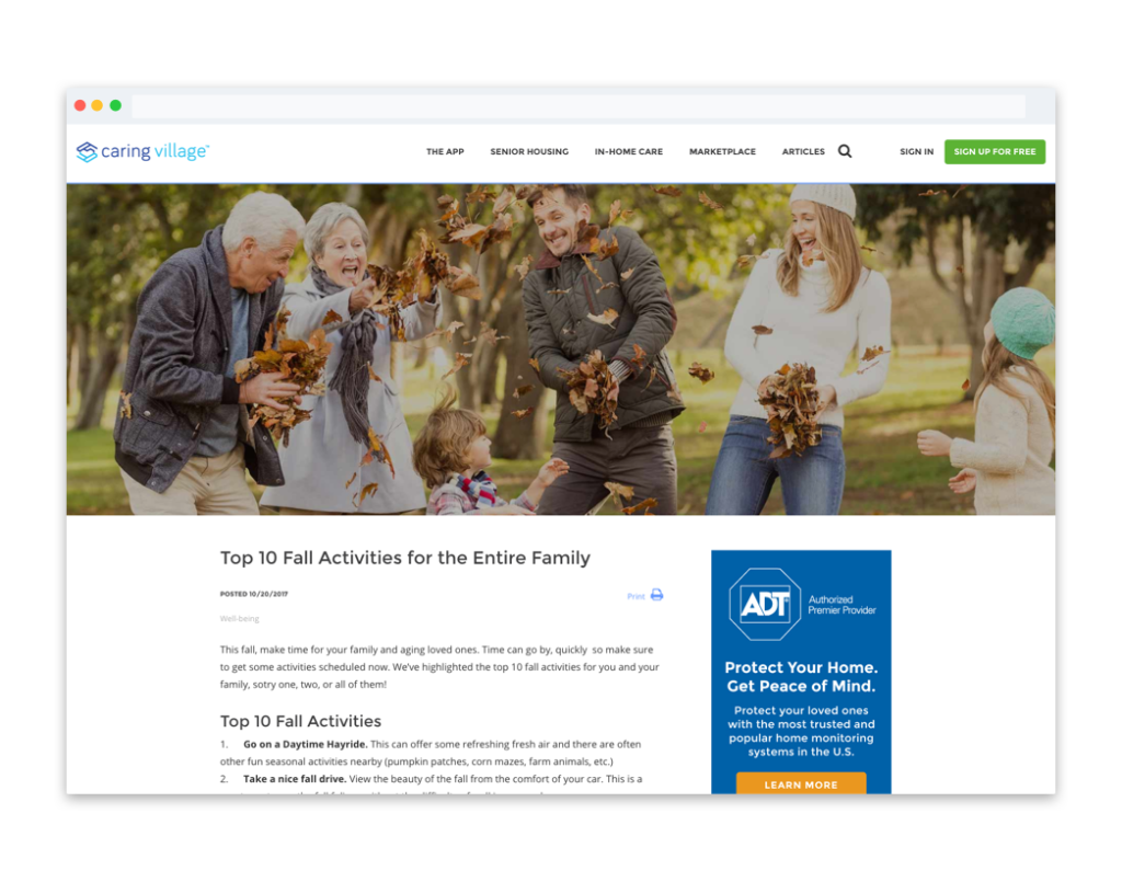
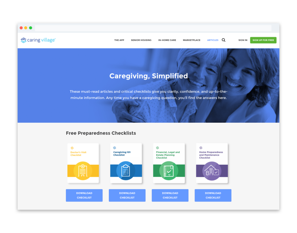
For the past couple years, the design team at Segue Technologies has worked on multiple digital products for Caring Village, a wholly owned subsidiary of Segue Technologies. Caring Village aims to make it easier for caregivers to communicate, collaborate, and coordinate care for their loved one. The website is a collection of resources (including articles and product reviews), while the app is a caregiver planning tool that connects family members and friends caring for a loved one. In building the Caring Village website from the ground up, we started with colors and branding, which flowed into the design of the website and apps. Knowing that caring for a loved one is an emotional subject, our team put a lot of effort into gaining user connections and maintaining users’ trust with an emotional web design. Here’s how these elements came into play for Caring Village.
Imagery
Throughout caringvillage.com, we use large photo banners with people who emulate our users. This is especially important for the article pages because we want users to value and trust the information we are giving them. By showcasing photos that are relatable, we hope to grasp user’s empathy and personally connect with them. We want the imagery to show that we understand, we care, and we are here to help.
Color
The colors chosen for Caring Village are green, blue, and purple.
- Green: symbolizes health, new beginnings, and wealth. Green is the easiest on the eyes and should be used to relax and create balance in a design. It is a great color to use if a company wants to depict growth and security, or to inspire possibility.
- Blue: evokes feelings of calmness and spirituality as well as security and trust. Seeing the color blue causes the body to create chemicals that are calming. Light blues give a more relaxing, friendly feel.
- Purple: associated with creativity, royalty, and wealth. Purple is often used to soothe or calm a viewer.
Tone of Voice
We wanted Caring Village’s tone to sound empathetic, knowledgeable, encouraging, and innovative. Some of the information on the Caring Village site discusses subjects that can be very sensitive to people who are caring for a sick loved one. In writing our content, we try hard to maintain a tone of voice that expresses to our users that we understand and value their needs.
At the end of the day our main goal is to make a connection between the user and the website. When taking into consideration images, colors, and tone of voice on a website, always put the users first.