I hear what you’re saying. Designing “above the fold” used to be the “in thing” to do in web layouts. But that was back then, and—unless you’re still living in the early days of the internet—this way of thinking just isn’t fitting anymore.
What is “Above the Fold”?
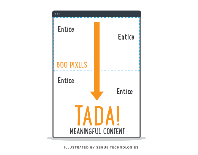
So, what does “above the fold” really mean? Originally, it was a newspaper term for the upper half of the front page which displayed the most important news stories and photographs. Papers are often displayed to customers folded so that only the top half of the front page is available to entice readers to buy the paper (source). Web designers adopted this idea and the “fold” concept evolved into put as much content as you can above the fold or people will never see it.
When it comes to web design, designing above the fold means putting all the stuff you deem important at the top and all the rest at the bottom, which limits your design options and can make your site look crowded. What if a newspaper put all of its quality content on the front page? How disappointed would you be to open the paper, only to find the leftovers? I believe the same thing applies to websites: if all the best content is forced upon the readers at the beginning, once they begin exploring they’re going to lose interest and go to another site.
The Mystery of “The Fold”
Another issue is that it is impossible to know exactly where the fold lies on a viewer’s screen. Monitors come in screen resolutions ranging from 800 x 600 up to 2560 x 1600 and people can have an unknown number and size of toolbars and add-ons on their browsers and devices.
For the new generation, scrolling through a site’s pages is now routine. In addition, as a designer, it is much more fun to utilize the entire screen area to showcase content in more exciting ways. I’m not saying you should fill your site with never-ending blocks of text and images, but I believe it is important to have relevant and enticing content on your site that makes your visitors want to scroll down the page. Draw your visitors into exploring your site gradually and fully, instead of overwhelming them with information at the start.
I am confident that people will scroll down the page if there’s interesting and valuable content to make it worth their while. Let your site tell your visitors a story as they scroll down and explore the real estate that lies beyond the fold.
Here are some things to keep in mind when designing your next website:
- Create valuable content for your site and give your viewers a reason to keep reading.
- Let each section lead your readers down the page.
- Know how your site displays at different resolutions, from hi-res monitors down to tablets and smart phones.
- Include a clear heading and description of what your website offers at the very top.
- Organize your site content in a hierarchy that allows for white space and information flow. This will encourage your visitor to carry on reading and scroll down the page.
- Spread your information out and divide into digestible chunks. Don’t try to cram everything in at the top of your web page.
- And most importantly, test test test! Always make sure to test your website across different browsers and devices.