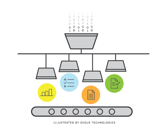
Information Visualization, as a field, is exploding in popularity. Whether it’s a new take on the humble bar chart, a choropleth in a news article, or an interactive replay of events over time, visualizations are the new way to get and hold people’s attention. Sometimes these visualizations are easy to whip up in a spreadsheet or online tool, other times they require powerful computation efforts and weeks of design to evoke the proper resulting product. Whether you’re designing, building, or just appreciating visualizations, there are some key concepts that make up all good visualizations. A good visualization tells a story, makes an impact, relays information, and is interdisciplinary.
Storytelling
At its core, information visualization is storytelling in visual form. This simple word – storytelling – has a lot wrapped up in it. Storytelling is taking the thoughts, ideas, opinions, and data that one person (or organization) has and conveying them to an audience in a memorable fashion.
Impact
The measure of a visualization is its impact. An animated, multi-diagram display backed by terabytes of processed data is nearly useless if it can’t be conveyed to the target audience in a memorable fashion. It’s important to know the target audience, know how to reach them, and know how to evoke a change in their mindset based on a visualization.
Information
Information = data + meaning. This doesn’t have to be technical. A book of fiction is information. A grocery list is information. The book has data in the form of letters, words, sentences, paragraphs, and chapters. The meaning of the book is how those words transform into thoughts in the reader’s mind.
Data in databases goes through the same process. Individual data elements in a database are often just as useless for conveying meaning as individual letters are for reading a book. Just as it takes effort for a writer to combine the letters into meaningful patterns, an analyst also has to combine data from databases into meaningful patterns. A visualization that uses data without meaning has little to convey to the audience and thus normally has very little impact.
Interdisciplinary
As you can see, information visualization covers a lot of areas that are traditionally considered wholly separate disciplines. In a large organization dedicated to creating products like these, each person may be able to operate within a single discipline. Most organizations aren’t so lucky, so the reality is that each person involved in creating a visualization will have to wear multiple hats throughout the process. As a result, people are drawn to the field from many areas: design, programming, journalism, statistics, and information architecture just to name a few.
Where Do I start?
If you want a visualization, you generally either start with data or with your message. When starting with your message, you define the impact you want your visualization to have. This impact can range from swaying the audience to side with your opinion to providing an executive summary of key measures in an enormous and dynamic data set. After defining the impact, you hunt for the data you need, transform the data into useful information, and visualize the information in a way the target audience can embrace. When taking this approach, always be careful to moderate your bias. There are many steps in the process of creating a visualization and a little bit of bias applied at each one can cause a significant and potentially unacceptable bias in the end result.
When starting with the data, you have one or more data sets that you want to turn into useful information. This approach is very research oriented and involves various iterations of transforming and perusing the data, often with a lot of data cleaning to enable consistency. Eventually one or more stories can be conjured out of the data and one of these can be chosen as the message for the visualization. Once the message is chosen, the rest of the process often moves more quickly because the data has already been massaged into a state near what is needed for the final product. When taking this approach always ensure a clear message is chosen. A collection of data may have multiple stories to tell and it is tempting to cram them into a single product. This combination will often result in a very muddled message to the target audience, thus reducing the impact of the visualization.
Regardless of where you want to start or what you want the result to be, Segue can help you with any stage of your analysis or visualization process. Contact us for more information.
