Drupal is a free, open source, content management system that enables you to easily organize, publish, and manage content. An open source development model means that people are constantly working to make sure Drupal is a cutting-edge platform that supports the latest technologies that the web has to offer.
Drupal and Responsive Design
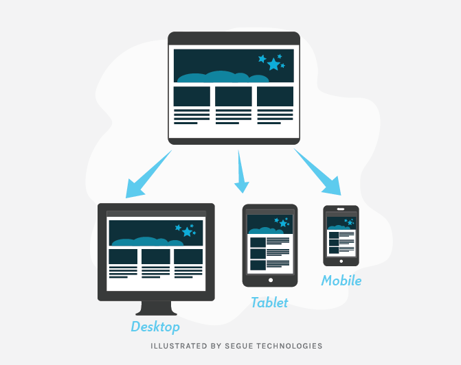
In the past, websites designed for mobile browsers depended on a detect and redirect mechanism, where a piece of JavaScript code would detect the type of device from which the request was made and redirect the call to a desktop version of the website (typically www.site.com) or mobile version of the website (m.site.com). However, with the advent of so many devices with a wide range of screen sizes, responsive design is a simple way of designing for all screen sizes. In this post, we will review how Drupal, a leading content management system, can implement responsive designs.
The look and feel of all Drupal websites is driven by themes. Designing custom theme requires knowledge of HTML and CSS. We will take a look at different techniques involved in responsive design and also how they apply to Drupal. Assuming we have a fixed width theme available, we will look at various mobile workflow techniques such as CSS3 media queries, fluid layouts, fluid images, responsive tables and responsive forms.
Identify Breakpoints
The first step in responsive design is to identify your break points and have a design for each breakpoint. A breakpoint is a point where the display changes based on the screen size. We recommend having at least three different breakpoints to cater for notebook/desktop, tablets, and mobile phones. However, each individual section can have more breakpoints based on the content.
Responsive Design
The main theory behind responsive design is to make every cell and column flow together. You build columns that float next to one another and adjust widths to scale with the screen size. As the screen size becomes smaller, columns begin to shrink and then, upon hitting a breakpoint, will stack on top of each other based on the design. The following steps demonstrate how to accomplish this:
1. Change pixel-based measurements to percentage-based measurements. Typically, each individual section (Menu, Header, Body, Footer) is wrapped in a container.
| Fixed Design | Responsive Design |
| .container {
Width: 960px; } |
.container {
Width: 100%; Max-width: 960px; } |
For elements inside the container, converting to percentages is based on a simple math and that math is Target divided by Context equals Results, or the percentage. Context is the parent element. Make sure to retain all of the decimals.
| Fixed Design | Responsive Design |
| .container .col1{
Width: 225px; } |
.container .col1{
Width: 23.4375%; /* (300 / 960) * 100 */ } |
2. Convert all margins and padding from fixed width based on pixels to percentage. However, it is important to understand that the context for margins and padding is the relative parent element they are enclosed in and not the main parent container.
| Fixed Design | Responsive Design |
| .container .col1{
Margin-right: 20px; } |
.container .col1{
Margin-right: 2.08333333333333%; /* (20 / 960) * 100 */ } |
| .container .col1 .some-class{
Margin-right: 15px; } |
.container .col1 .some-class{
Margin-right: 6.66666666666667 %; /* (15 / 225) * 100 */ } |
3. To make text fluid and flexible, convert font-size from pixels to em. For most of the browsers assume 16px to be 1em. Again, make sure to use as many decimals as the conversion leads to.
| Fixed Design | Responsive Design |
| .some-class{
Font-size: 16px; } |
.some-class{
Font-size: 1em; } |
| .some-class{
Font-size: 30px; } |
.some-class{
Font-size: 1.875em; } |
Setting a base rule like below will help reduce, increase the font size by adjusting the percentage. 100% is assumed at 16px;
Body { Font-size: 100%; }4. Handling images in Drupal needs a two part solution. Drupal automatically adds width and height attributes to images. This is handled in latest browsers by setting height:auto in css. However, to deal with older browsers we need to manipulate the Drupal theme template file (template.php) to remove the width and height attributes.
function themename_preprocess_image(&$variables) { foreach(array(‘width’, ‘height’) as $key) { unset($variables[$key]); } }The most important css change when dealing with images (or videos and other embeded objects) is to have the image in a container and set the max-width of the image to 100%.
Img { Width: 80%; Height: auto; Max-width: 100%; }5. While setting max-width: 100% and height: auto works for HTML 5 videos. It does not necessarily work for embedded videos. For videos that use iframe, enclose video in a div and add styling.
.video-container { position: relative; height: 0; padding-bottom: 55%; /* Anything really */ padding-top: 25px; overflow: hidden; } .video-container iframe, .video-container object, .video-container embed,{ position: absolute; top: 0; left: 0; height: 100%; width: 100%; }6. CSS3 media queries not only allow you to target certain devices classes, but can actually inspect the physical characteristics of the device. New media features include max-width, device width, orientation and color. These media queries, in conjunction with JavaScript and jQuery, are used to handle different breakpoints. jQuery is helpful in handling situations where there is transition between breakpoints based on some user action (e.g. changing the device orientation needs to clear a menu or some other element or reset a particular user selection).
.page-footer-copyright { p { font-size: 0.750em; font-family: “museosans-300”, Helvetica, Arial, sans-serif; } } @media screen and (max-width: 56.5em) { .page-footer-copyright { p { margin: 2.5em auto; } } }All the above principles have been used in making this Segue corporate website (www.seguetech.com)responsive. In addition to above discussed techniques, Drupal offers some themes like omega, zen, adaptive and terrain which provide a decent baseline to make websites responsive. Also, there are additional packages like zurb and others that help make tables and forms responsive.
Making a Drupal site responsive is not very different than making a responsive site in any other content management system (like WordPress). Establishing proper breakpoints and using CSS wrappers effectively will let your site shine on any size screen.