As a company, Segue has been working with and enhancing our capabilities to provide mobile application and website development for several years. “Mobile” is hot in the development world and will continue to be with the steady increase of users around the world. We ultimately see this trend as just a new evolution of development. Right now there is a distinction between a mobile site and a standard website, but that’s because we are in a transition period. What that means is that there are a great number of websites and web applications that don’t render well on the small screen sizes of mobile and tablet devices (or that don’t take advantage of larger than average displays either); they weren’t designed for them but visitors are going to them anyway. Website visitors have evolved to expect a website to work properly and display beautifully and be responsive on all the devices they use.
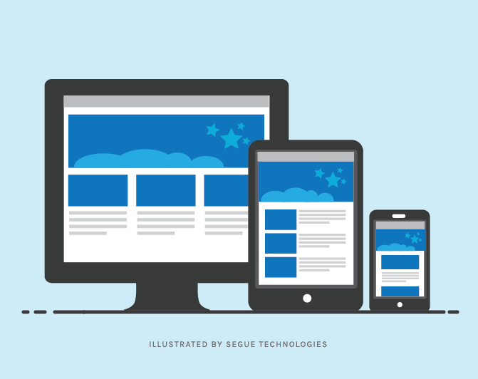
As the adoption rate of handhelds and tablets increases, these devices have taken over as the primary way people access the internet. People buy them for their features – phone, camera, apps – but they also use them for traditional PC tasks such as web browsing, email, and more. This increases the frequency that people will visit websites that weren’t designed for displays of different sizes, and have a disappointing or frustrating user experience. With so many alternatives available, your audience will go to another site to get what you are offering. A responsive design for websites resolves this issue, not by designing multiple sites to support all current devices, but by designing one site that is able to adapt to a multitude of display types. A single code base, a single set of content to maintain, but one that adapts to all of your visitors’ devices. This is particularly valuable as new devices with different screen sizes are constantly being developed.
Why It Became Time to Commit to Responsive
Segue had been weighing several factors for going responsive with our own website. We have to balance our resources to ensure our priority is on our customer projects and consider the improvement that responsive design would provide our site vs. the internal costs of doing the work. There were several areas of our site that we wanted to improve the look and feel of, and to optimize for mobile displays, but we only have a few user actions, so there hadn’t been a pressing functional need to commit. However, in looking at the bigger picture of the future state of website design and user trends, factors added up to make a clear case that we needed to make our site responsive. Below are some of the driving considerations behind our decision to implement a responsive design website:
That indomitable mobile trend: The increase in use of mobile devices is not a phase or a flash in the pan. There won’t be a new innovation in large, immobile desktop computers that entices people to ditch their mobile devices and go back to their desks. I was attending one of Chris Brogan’s “ImpactNext” seminars and in discussing the mobile first world, he expressed that if people couldn’t see your site on a mobile device, then they essentially couldn’t see your site. As the mobile trend becomes the mobile standard, sites that don’t adapt are going to be unavailable to, or ignored by, users. A non-responsive site that exists now and refuses to adapt, will essentially disappear.
We’ve stepped up our site offerings: Segue has dedicated more time and resources into our site content, generating blog articles on an almost daily basis, using our site to educate visitors and capture potential customer leads. Our site is also more visual; we have more CTAs (calls to action) for visitors to take, and we really, really want people to read our content. Going responsive is part of our changing mindset about our own site from “the information is there if you are interested” to “we’d really like you to learn about what we can do and we really want to make that experience easy and enjoyable for you.”
We wouldn’t ask you to consider something that we didn’t do ourselves: We really think that anyone who has a web site/application needs to have a responsive design. If you use your site to support a community, provide education and/or services, or conduct business, you need to have a site that reaches the fullest possible audience, so it should render beautifully and be easy and intuitive to use on all devices and screen sizes. This is true for you, and just as true for us, so if we are to advocate to our customers for responsive sites and applications, then we needed to step forward ourselves.
Post Launch
The first time I saw the new Segue site on my mobile phone, I knew we had done the right thing. It just fit. There wasn’t any pinching and zooming needed. I didn’t have to use my memory of the site to navigate, and best of all, I didn’t have to say a prayer every time my fat fingers zeroed in on a link. In the redesign process we had a chance to think more from a visitor’s perspective, what they would want to see and how they would navigate through our site. This was a critical step in determining layout and menus for tablet and mobile sizes, but it also led to some revisions to the desktop layout, which was mostly unchanged through this effort. This was the unanticipated benefit of the project that added to the factors that we had considered above, to make a responsive redesign the right move for our corporate website.